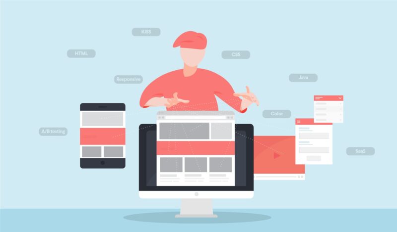
One of the most important aspects when it comes to designing a website is capturing the attention of your audience. There are many ways to do so, but one way that has proven effective time and time again is through design features.
These can be used in different parts throughout your site, but often they are most effective at the beginning where visitors land and look first.
Colour Scheme
A bright or eye-catching colour scheme that will draw attention from the get-go is the perfect way to gain attention. You can use something that will be difficult to ignore or blend in with your background so there is less competition for attention.
Design Elements
This refers to anything you might find on a website, such as buttons and banners – anything really! These could be used throughout the site but are often best at the beginning where people first land before scrolling down or moving through other pages. It’s important to include these because they not only look good but also serve their purpose of making it easy for users to navigate around your site by providing links (such as “book now”, “contact us” etc.). Using design features like this ensures that navigation is convenient and efficient which means people come back again another time without difficulty.
Headlines and Titles
Headlines with catchy phrases that intrigue readers who may not know much about your company’s products or services. If you have a website with lots of content, this is your chance to persuade visitors that they should stay and read it all.
The most important thing about the headline is making sure it’s relevant to what follows next so people know whether or not these paragraphs are going to be useful for them.
Studies show that headlines in web design can help improve conversion rates because users pay more attention when there’s something specific and interesting feature on the top. They also tell Google what your site page contents include which makes SEO (search engine optimization) easier and helps search engines direct the right audience towards you too!
Lists
Bullet points make information easy for readers to scan quickly without getting distracted by other words around them while scrolling down the page. This means that the information is more likely to be read. However, this doesn’t mean that bullet points should be used for all paragraphs of your content because it can make readers feel like they’re reading a list rather than an interesting text.
Animations and Videos
They’re fairly straightforward to use, and they can be a fantastic method to explain how something works. It might just be an animated text or photograph that captures the attention of the audience. However, it also included basic elements such as changing the colour of a button when it’s pressed. It adds to your website’s overall user experience and leaves a lasting impression.
Fonts
Fonts are an important design element that should be considered carefully but are often underestimated. They play a significant role in setting the tone of your website. For example, if you want to make it look more professional and corporate use serif fonts such as Times New Roman or Calibri. On the other hand, sans-serif fonts are often used for conveying simplicity and cleanliness – perfect for blogs, magazines or personal websites!
Images
Images are an excellent way of capturing attention because it provides a break from just reading text on a screen but too many images without any content in between might become boring quickly! If there is nothing else left that will help improve readability or make something easier to understand then adding some photos or graphics could help increase engagement with people scrolling down the page.
Space
One of the most important factors is the space around each element on the page. If you have too much space between elements then they will become less noticeable and if there isn’t enough, it can make things feel overcrowded or uncomfortable to read. For example, a heading followed closely by some text is more suitable than having it with a large amount of white space in-between them because this makes both look like separate parts rather than one cohesive unit which helps guide people through the information presented across the web design.
Conclusion
Designing a website is complex and challenging. Addressing the above-mentioned factors is a good starting point to create a very precise result to achieve the best possible user experience. Contact web design Sunshine Coast if you need assistance.